Case Studies
Show all


Transforming the user experience of a large scale legacy platform in 4 weeks.
Background and Context
A platform built for power, not polish
Benchmark Estimating is the platform of record for large-scale infrastructure cost estimation across Australia, the UK and New Zealand. Its users — predominantly senior estimating engineers — work with staggering complexity on a daily basis: projects spanning billions of dollars in capital expenditure, data sets of extraordinary depth, and the kinds of precision-critical decisions that cannot afford to be obscured by a difficult interface.
The platform had grown organically over many years. Features had been layered upon features, workflows had evolved, and the user interface — while functional and deeply understood by its long-term users — had accumulated the debt that all mature software eventually accumulates. The visual language was dated. Key workflows carried unnecessary friction. And for prospective clients evaluating the platform for the first time, the first impression lagged behind the capability it concealed.
"The product was powerful. The problem was that it no longer looked like it was."
Benchmark Estimating engaged Vigo to close that gap — to modernise the experience in a way that would demonstrate to both existing and prospective clients that a new era of the product was on the horizon, while also alleviating the most acute day-to-day usability pain points for the engineers who depend on it.
Technical Constraints
The rules of engagement
This was not a greenfield redesign. The scope of the engagement was explicitly bounded by one fundamental requirement: the underlying application architecture could not be altered. No database changes. No API refactoring. No restructuring of component hierarchies or application routing. The development team had a roadmap of their own, and our work needed to be absorbed into the existing codebase with minimal disruption and maximum speed.
This constraint, far from limiting the work, sharpened it. It forced a precision of thinking that a blank canvas rarely demands — every proposed change had to pass a feasibility test, every design decision had to be anchored in what was genuinely achievable within the existing system.
What was in scope
Visual styling, typography, colour, spacing, iconography, component presentation, data table layout and density controls, dashboard structure, empty states, loading states, micro-interactions and motion
What was out of scope
Application architecture, data models, routing, backend logic, structural component hierarchy, feature additions, or anything requiring changes to the platform's core engineering.
The delivery mandate
Design and development needed to move in lockstep. This was a stop-gap release — not a design system vision exercise. Every decision had to translate directly into a buildable, shippable outcome within the engagement window.
The audience imperative
The redesign had to serve two audiences simultaneously: the seasoned estimating engineers who use the platform daily and expect efficiency above all, and new or prospective clients seeing the platform for the first time and forming a first impression.
Discovery & Orientation
Getting inside the world of infrastructure estimation
The first priority was understanding the subject matter. Cost estimating for major infrastructure — roads, rail, utilities, water, telecommunications networks — is not a domain that yields quickly to the generalist. The data is layered, the workflows are methodical, the terminology is specialised, and the stakes are high. Getting the design wrong is not merely an aesthetic failure; it can introduce genuine workflow disruption for professionals whose output directly influences multi-billion dollar decisions.
We immersed ourselves quickly: in the application itself, in sessions with the Benchmark team, and in conversations with estimating engineers about how they actually work. We mapped the primary user journeys, identified the moments of highest friction, and developed a clear picture of what the platform's users valued most.
What estimating engineers told us
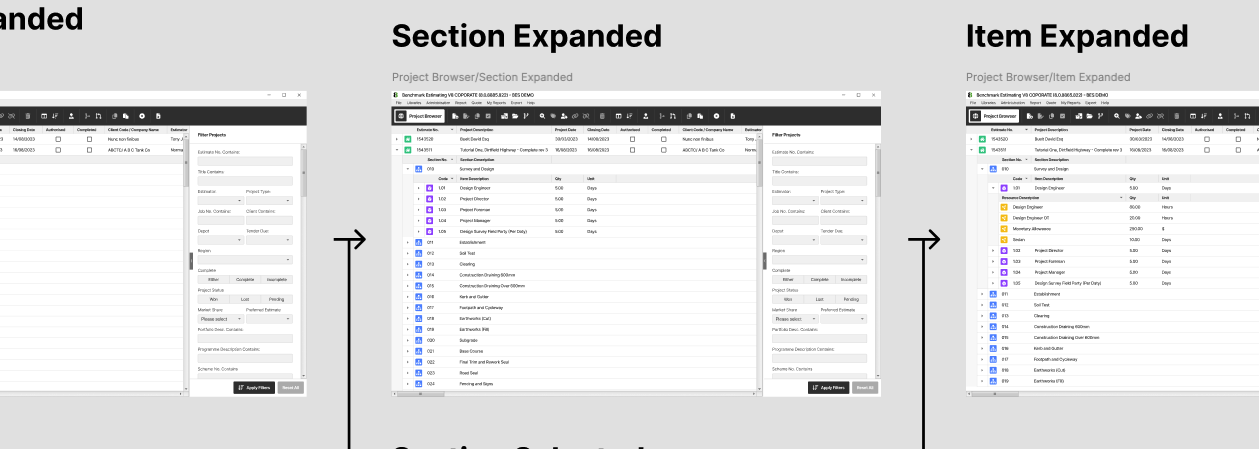
The users of this platform are not casual software consumers. They are professionals who have invested significant time in mastering a complex tool, and who have legitimate expectations that a redesign will not displace familiar patterns or introduce relearning costs. Their primary demands were consistent: density of information, speed of navigation, and clarity under data-heavy conditions.
The ability to view large volumes of cost data simultaneously — across work breakdown structures, rate libraries, resource categories, and project hierarchies — was not a nice-to-have. It was the central requirement around which everything else needed to be designed. A beautiful interface that reduced data visibility would have been worse than no redesign at all.
Our Approach
Four weeks. Three disciplines. One tight brief.
We assembled a lean team of three: a senior designer responsible for UI direction and visual execution; a product strategist who led discovery, user insight synthesis and design rationale; and a frontend developer embedded from day one whose role was not to build in isolation at the end, but to act as a real-time feasibility partner throughout the design process.
This structure was deliberate. In constrained engagements, the most expensive mistake is designing something unbuildable. Having our developer in every design conversation meant that ideas were tested against reality continuously — not validated in a vacuum and handed over with crossed fingers.
Week 1: Orientation & Constraint Mapping
Deep-dive into the application, the domain, the existing user base and the technical boundaries. Identifying the highest-impact areas for uplift within the non-structural scope. Establishing design principles and a visual direction.
Week 2: Rapid Iteration & Feasibility Loops
High-velocity design exploration across priority screens. Daily feasibility checks with the frontend developer and ongoing alignment with the Benchmark development team to confirm what was achievable in the existing codebase.
Week 3: Refinement & Handoff Preparation
Consolidation of the design direction, resolution of edge cases, stress-testing of data-heavy layouts with realistic content volumes. Preparation of detailed specifications for the Benchmark development team.
Week 4: Developer Collaboration & Delivery
Close collaboration with the Benchmark engineering team during implementation. Answering questions, resolving ambiguities, and ensuring that the built output reflected the intended design with the fidelity the engagement demanded.
Focus Areas
Where the work concentrated
Not every corner of a large application can be meaningfully addressed in four weeks. We made deliberate choices about where to concentrate effort — guided by the severity of existing usability issues, the visibility of those areas to prospective clients, and the feasibility of improvement within our constraints.
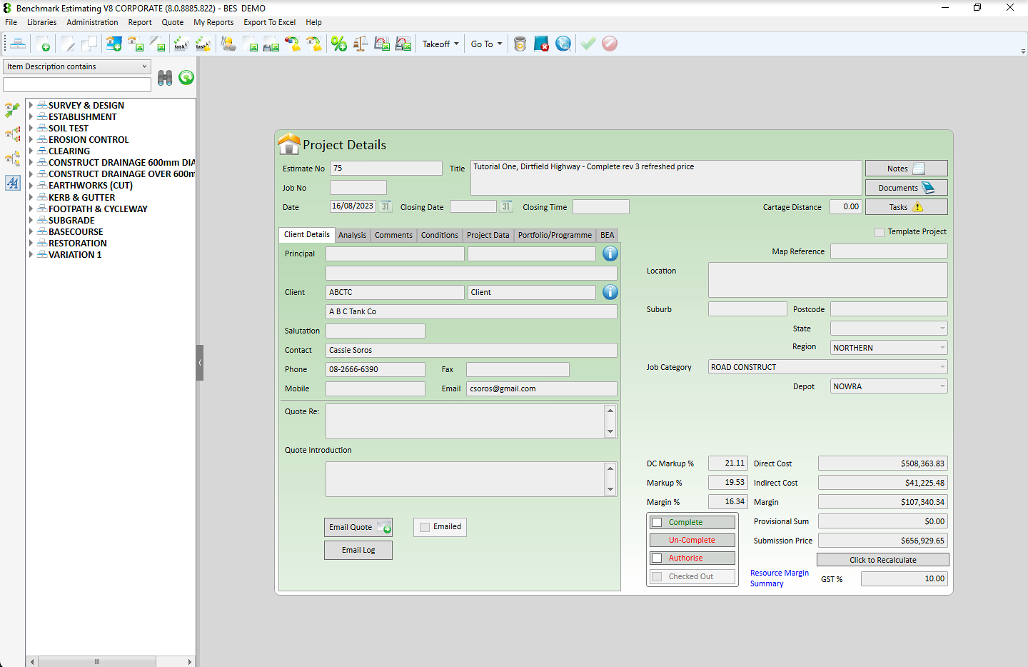
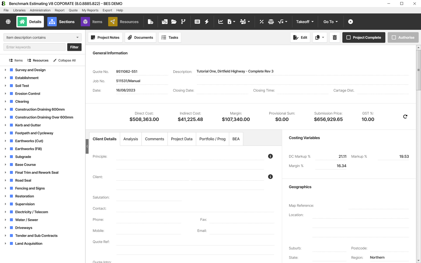
Dashboards & Overview Surfaces
The entry points to the platform — where clients first land and where prospective users form their initial impression. We re-examined information hierarchy, visual weight, and the communication of key metrics to make the platform feel purposeful and considered from the first glance.
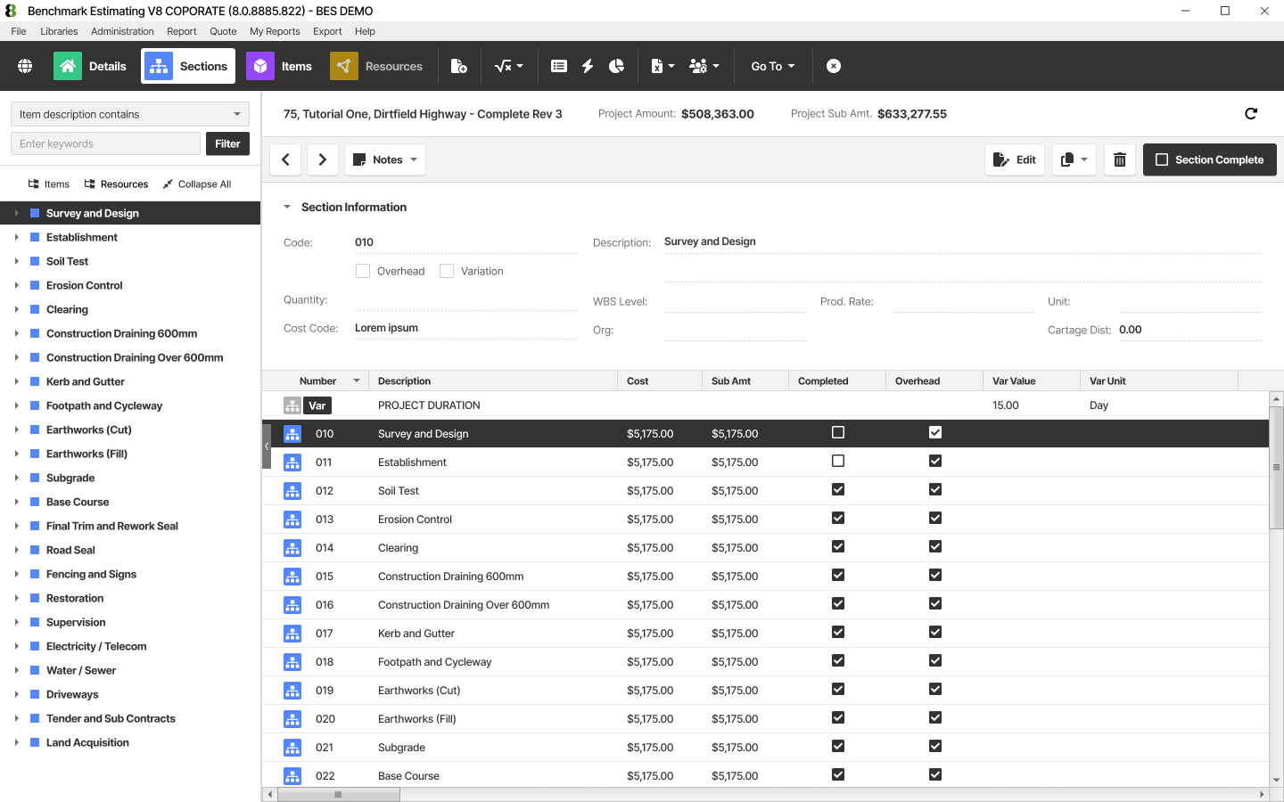
Interactive Data Tables
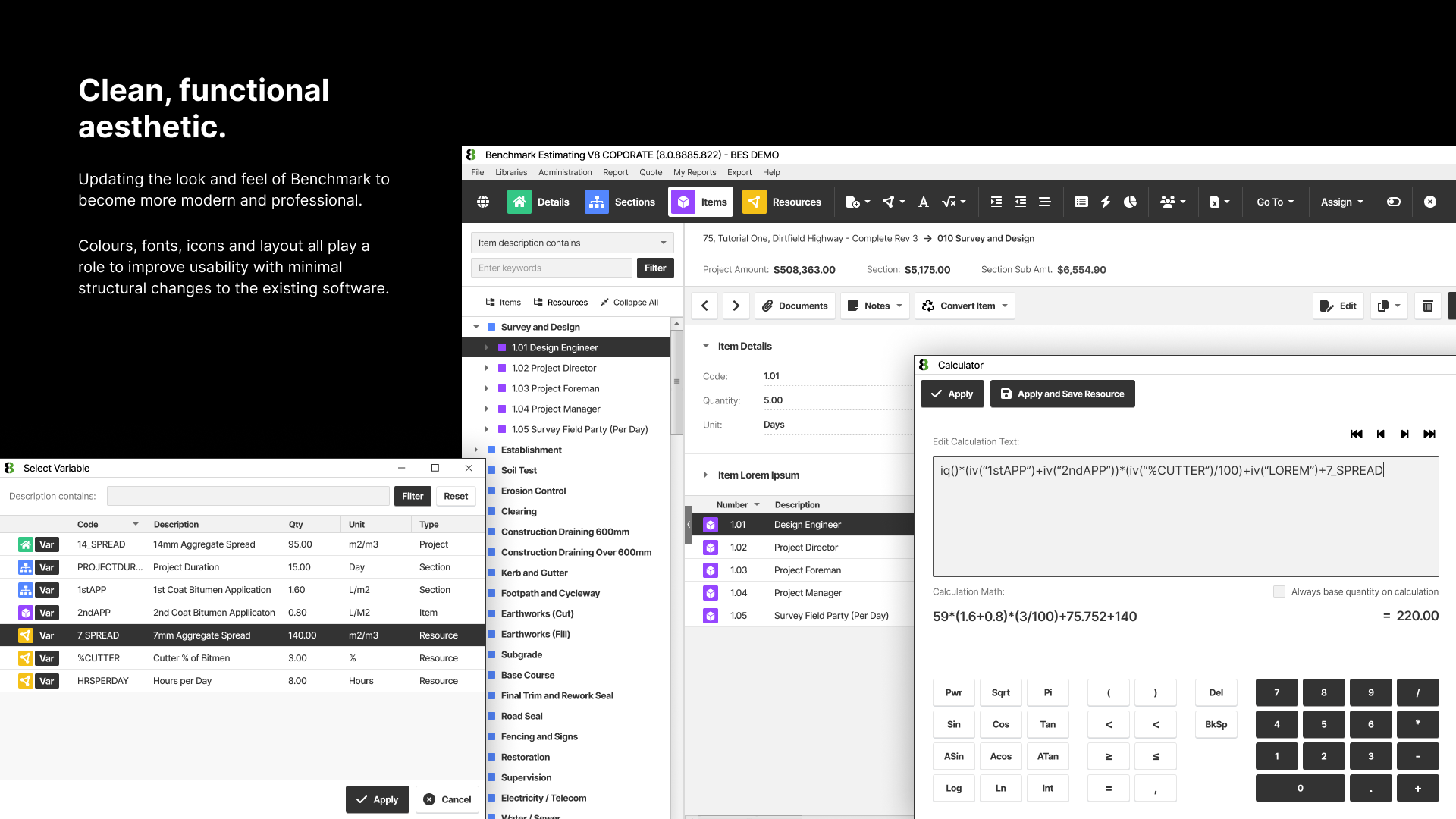
The engine room of the estimating workflow. Users needed to view and navigate enormous volumes of structured cost data without losing context or scrolling into oblivion. We redesigned density controls, row states, column legibility, and header behaviour to maximise usable data per viewport.
Visual Language & Typography
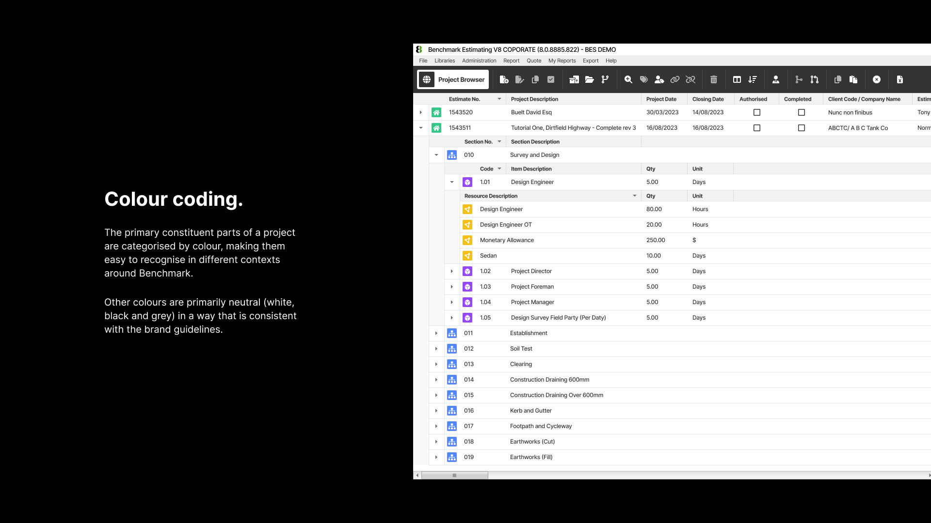
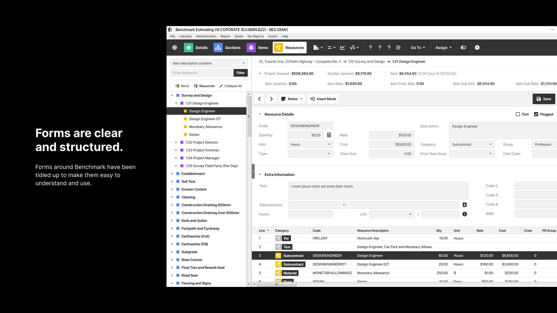
A systematic refresh of the platform's visual foundations — colour, type hierarchy, iconography, spacing and component styling — applied consistently across the surfaces in scope to convey a modern, professional, and distinctly engineering-grade aesthetic.
States & Feedback Moments
Loading states, empty states, confirmation patterns and error handling — the moments between interactions that reveal whether a product feels crafted or assembled. Addressing these consistently raised the perceived quality of the entire experience.
Navigation & Wayfinding
A complex application with a broad feature set demands navigation that allows experienced users to move at speed. We refined the platform's navigational structure — within our non-structural bounds — to reduce clicks, surface context, and reduce the cognitive load of finding the right place.
High-Volume Data Readability
Estimating engineers frequently work with hundreds or thousands of line items simultaneously. We introduced typographic and layout refinements specifically designed to sustain legibility and reduce eye strain across extended sessions with dense, numerically rich data.
Results
A platform that now looks equal to what it can do
Despite the tight constraints and compressed timeline, the engagement delivered a meaningful and visible transformation. The Benchmark Estimating team and their users received the redesign with genuine enthusiasm — a response that reflects both the depth of the usability improvements and the credibility of the new visual direction.
A modernised visual identity for the platform that signals forward momentum to existing and prospective clients, without disrupting the familiarity that experienced users rely on.
Substantially improved data table readability and density management, enabling estimating engineers to view and navigate larger volumes of structured data with less friction and greater confidence.
Dashboard surfaces redesigned to communicate key metrics with clarity and visual authority — transforming the first impression of the platform for new viewers.
A design system foundation, established within the engagement, that provides the Benchmark development team with a consistent visual language to carry forward into the product's next chapter.
A delivered output that was buildable, shipped, and live — not a concept deck or a speculative vision, but a real product improvement in the hands of real users.
A productive working relationship between our studio's frontend developer and the Benchmark engineering team, creating a template for how future collaborative engagements can operate efficiently.
The team grasped our domain quickly, respected our constraints entirely, and delivered something that made the platform look and feel like it belongs to the next decade of the product — not the last one. Benchmark Estimating
We use cookies for analytics and marketing. No data is shared with third parties.