Case Studies
Show all


Why Enterprise Dashboards Fail: 6 UX Mistakes We See Again and Again
We've redesigned a lot of enterprise dashboards. And in almost every project, we find the same problems waiting for us: a screen that was built to impress a stakeholder in a demo rather than help an actual user do their job.
That's the uncomfortable truth about enterprise dashboards. They rarely fail because of bad data or missing features. They fail because the people who built them never properly asked: who is this for, and what do they need to do in the next 60 seconds?
The result is predictable. Overwhelmed users who stop trusting the interface, and by extension, stop trusting the data behind it. Dashboards that get bypassed in favour of spreadsheets. Decision-making that slows down rather than speeds up.
Below are the six UX mistakes we encounter most often, along with what we do to fix them.
Quick summary: Enterprise dashboards fail when they prioritise data completeness over usability. The six core mistakes are information overload, no role-based hierarchy, ignoring mobile, skipping progressive disclosure, inconsistent design systems, and burying the most important signals in visual noise.
Mistake 1: Showing Everything Because You Can
This is the most common mistake, and it usually starts with a reasonable impulse. The team has worked hard to surface all this data, stakeholders want to see it, and nobody wants to be the person who argues for showing less. So everything goes in.
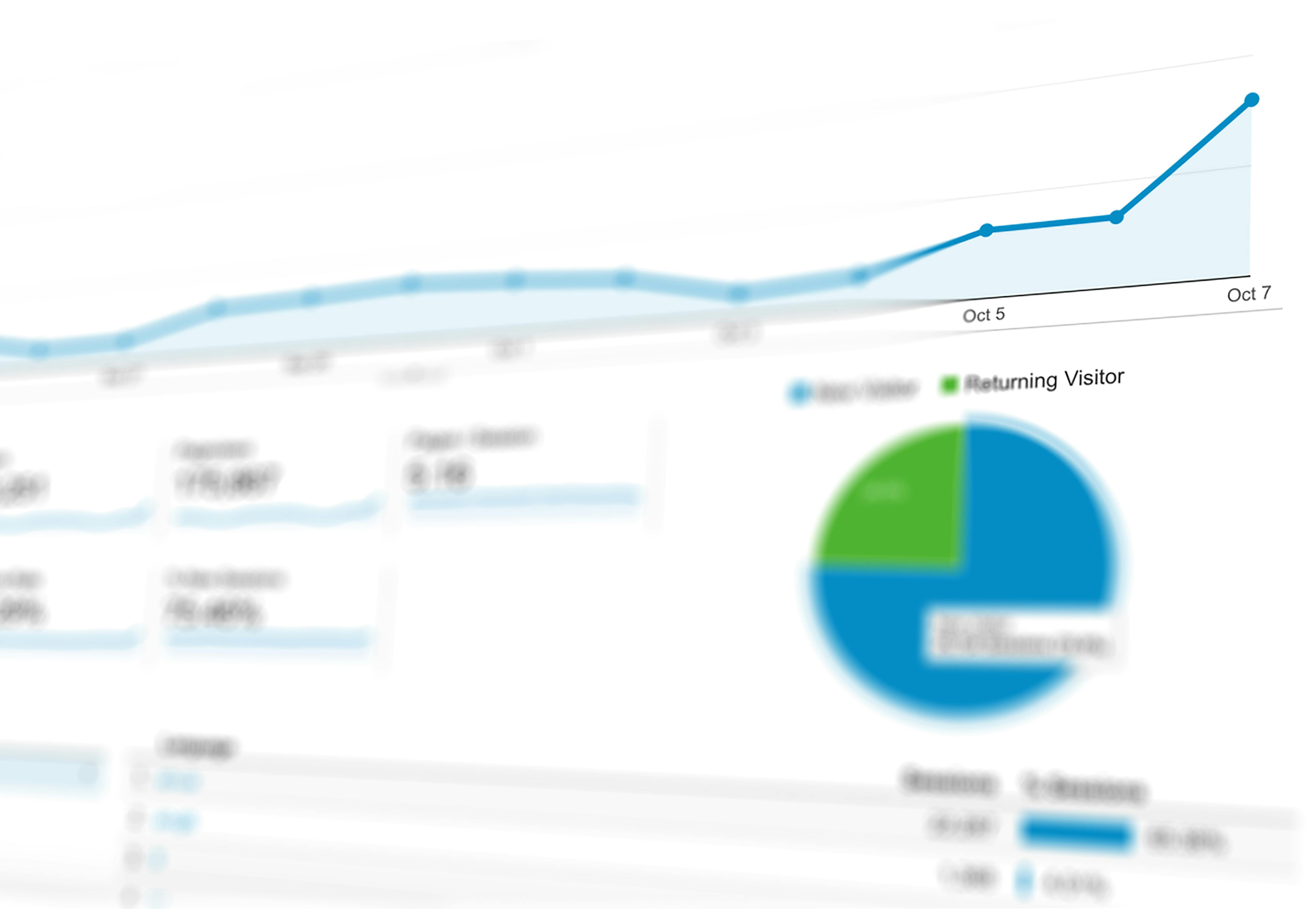
The problem is that when everything is visible, nothing is important. A screen with 40 KPIs, six chart types, and three data tables isn't a dashboard. It's a report pretending to be one.
The cognitive cost is real. Research from UXPin found that dashboards with more than six major components led to a 22% drop in task completion speed. Users don't get better at reading cluttered dashboards over time; they get better at ignoring them.
What we do instead
We start every dashboard project by asking a deceptively simple question: what is the single most important thing this user needs to know when they open this screen? From there, we build outward. The primary metric gets visual prominence. Secondary metrics sit below it. Everything else is accessible but not intrusive.
A useful test: if you covered every element except one, would the user still understand what action to take? If the answer is no, the hierarchy isn't working.
Mistake 2: One Dashboard for Every Role
A CFO and a regional operations manager both log into the same dashboard. They see the same metrics, the same charts, the same layout. The CFO is looking for margin trends. The operations manager needs to know which sites are underperforming today. Neither of them gets what they actually need, because the dashboard was built to serve everyone and ended up serving no one particularly well.
This is what we call the "one-size-fits-none" problem, and it's endemic in enterprise environments where a single platform serves multiple departments.
The fix: role-based views
The solution isn't to build a separate dashboard for every user. That's expensive and creates a maintenance nightmare. The better approach is a shared data layer with role-based views layered on top.
In practice, this means:
Identifying two or three primary user archetypes (executive, analyst, frontline operator) and designing the default view around each
Using permissions and filters to surface only the data relevant to a given role by default
Allowing personalisation within those defaults, so power users can customise without disrupting the experience for everyone else
The key insight here is that relevance drives adoption. When users open a dashboard and immediately see the numbers that matter to their job, they come back. When they have to wade through irrelevant data every time, they don't.
Mistake 3: Treating Mobile as an Afterthought
Enterprise dashboards are still largely designed for a 27-inch monitor in a meeting room. The assumption is that the people who use them are sitting at a desk. That assumption is increasingly wrong.
Senior decision-makers check dashboards on their phones between meetings. Field teams access operational data on tablets. A dashboard that falls apart below 1440px isn't just inconvenient; it's genuinely unusable for a growing portion of its audience.
The irony is that the people most likely to access dashboards on mobile are often the most senior users. A CEO checking revenue figures on a Friday afternoon isn't doing it from a desktop.
Designing for the mobile moment
Mobile-first doesn't mean stripping everything back to a single number. It means asking a different question: what does this user need when they're not at their desk?
The answer is usually a subset of the full dashboard. The most critical KPIs. Any alerts or anomalies that require action. The ability to drill down if something looks wrong.
Practically, this means:
Responsive layouts that reflow sensibly at smaller breakpoints, not just shrink everything down
Prioritising tap targets over hover states for interactive elements
Surfacing alerts and exceptions first on mobile, since that's usually why someone is checking on the go
Testing on actual devices, not just a browser window resized to 375px
We've found that addressing mobile properly often forces useful conversations about information hierarchy that improve the desktop experience too.
Mistake 4: No Progressive Disclosure
Progressive disclosure is one of those UX principles that sounds obvious once you hear it, but gets ignored constantly in practice. The idea is simple: show users what they need at a glance, then let them dig deeper on demand. Don't make them wade through depth-three data just to get to the summary.
Most enterprise dashboards do the opposite. They present everything at the same level of detail, forcing users to mentally filter signal from noise every time they log in.
Here's what this looks like in the wild: a logistics dashboard where every route, every vehicle, and every delivery window is visible simultaneously on the opening screen. The operations manager who needs to spot today's delays has to scan through hundreds of rows to find them. The data is all there; the access to what matters is broken.
Layers, not dumps
Progressive disclosure means designing your dashboard in layers:
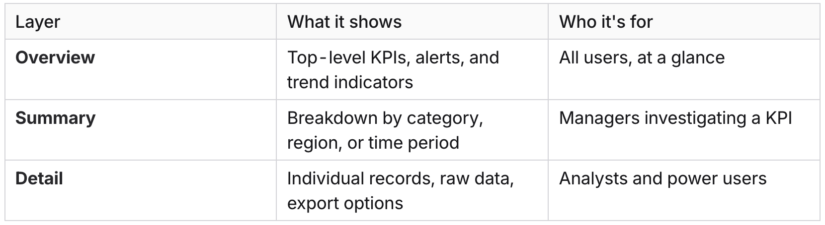
Each layer should be accessible from the previous one via a clear interaction: a click, a drill-down, an expand. The user chooses how deep to go. The dashboard doesn't force them to see everything at once.
This approach also makes dashboards significantly faster to load, since you're not rendering every data point on the initial screen.
Mistake 5: Inconsistent Design Systems Across Modules
This one is particularly common in enterprise environments where dashboards have been built incrementally, often by different teams or vendors over several years. The finance module looks different from the HR module. The CRM integration uses different button styles, different colour conventions for status indicators, and a different navigation pattern. Each piece was built to spec, but nobody was thinking about the whole.
The result is a dashboard that feels like five different products stitched together. Users have to re-learn basic interactions every time they switch context. What does a red badge mean in this module? Is that the same red as the alert colour in the other module? Nobody is sure.
Inconsistency doesn't just look bad. It erodes trust. When the interface behaves differently in different places, users start second-guessing the data too.
The design system conversation
The fix isn't just cosmetic. It requires agreeing on a shared design language before building anything, and enforcing it across every module, integration, and third-party component.
At minimum, this means standardising:
Colour semantics: what red, amber, and green mean across the entire product (and sticking to it)
Typography and spacing: consistent scale, not each module choosing its own
Interactive patterns: the same component library for filters, date pickers, tables, and modals throughout
Status and alert conventions: one way to show a warning, not four
When we come into a dashboard redesign project, auditing for inconsistency is usually one of the first things we do. It's often where the quickest wins are. Bringing a fragmented interface into a coherent system can dramatically improve perceived quality without changing a single data point.
Mistake 6: No Visual Hierarchy for What Actually Matters
This is subtly different from information overload. You can have a relatively focused dashboard with a manageable number of metrics, and still fail completely at communicating which ones require attention right now.
Visual hierarchy is how a user's eye moves through a screen. Good hierarchy means the most important information is seen first, critical alerts are unmissable, and secondary data recedes until it's needed. Poor hierarchy means everything competes for attention equally, and the user has to work out for themselves what's urgent.
We see this most often in dashboards that were designed by engineers rather than designers. All the data is accurate and present, but it's presented in a flat, uniform grid where a critical system alert sits at the same visual weight as last month's archived report.
How to create hierarchy that actually works
Effective visual hierarchy in dashboards comes down to a few core principles:
Size signals importance. The metric that matters most should be the largest thing on the screen. Not slightly larger; noticeably larger.
Colour should be meaningful, not decorative. Reserve strong colours for states that require action (red for critical, amber for warning). If everything is colourful, nothing is urgent. Research from UXPin shows that dashboards with a limited, purposeful colour hierarchy (three to five base colours) reduce user errors by 37%.
Position carries weight. Users in most Western markets read top-left first. The primary KPI belongs there, not in the centre of a symmetrical grid that treats all data as equal.
Whitespace is not wasted space. Giving important elements room to breathe makes them stand out. Dense grids, where every pixel is filled, flatten hierarchy by eliminating contrast.
The goal is a dashboard where a user can open it, glance for five seconds, and know whether everything is fine or something needs their attention. If that's not happening, the hierarchy is broken regardless of how accurate the data is.
The Common Thread
Every one of these mistakes comes back to the same root cause: the dashboard was designed around the data rather than around the person using it.
That sounds like a simple fix, but in practice it requires pushing back on stakeholders who want to see everything, aligning multiple teams on a shared design language, and investing in proper UX discovery work before a single component gets built. It's not glamorous, but it's the difference between a dashboard that gets used and one that gets quietly abandoned.
If your users are bypassing your dashboard in favour of spreadsheets, that's not a data problem. It's a design problem.
The good news is that these are all solvable. We've seen dashboards go from genuinely unusable to genuinely loved with focused redesign work, and the business impact is measurable: faster decision-making, higher adoption rates, and fewer escalations from users who can't find what they need.
If you're working through a dashboard redesign, or you're about to commission one and want to avoid these pitfalls from the start, we're happy to talk it through. A good discovery conversation costs nothing and usually surfaces a few things worth knowing before you commit to a direction.
We use cookies for analytics and marketing. No data is shared with third parties.